Disney isn’t just a brand; it’s a cultural institution. It’s that familiar castle, the unmistakable signature scrawled across everything, and the spark of imagination that spans generations. For a company so deeply interwoven into the global consciousness, any move to update its identity naturally sends a tidal wave through the marketing and design communities.
Recently, Disney introduced a series of subtle, yet highly strategic, changes across its massive ecosystem, prompting the critical question: Did Disney actually rebrand?
At Spotlight Creative Agency, we specialise in understanding the difference between a total brand overhaul and a necessary, strategic identity evolution. In this in-depth case study, we’re pulling apart Disney’s recent movements to determine precisely what happened, why they did it, and what vital lessons your own business, regardless of size, can take away when navigating heritage and modern relevance.
The Weight of Heritage: Why Disney Couldn’t Hit the Reset Button
Before we dive into what they did, we have to talk about the near-impossible task Disney faces. A rebrand usually means wiping the slate clean, a fundamental shift in name, logo, and core identity. Think of a company pivoting after a huge scandal or a merger demanding a neutral new look.
Disney simply can’t do that.
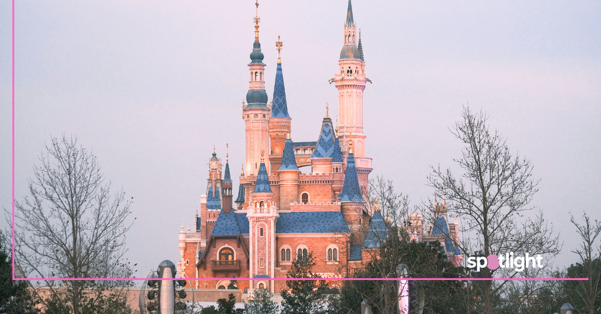
Their core equity, the assets holding immense, positive value, are inextricably linked to nostalgia, tradition, and recognition. The famous Walt Disney signature is arguably the most valuable piece of typography in the world. The Magic Kingdom castle silhouette is instantly recognisable. Throwing those assets away? That would be catastrophic, erasing billions in goodwill and decades of emotional connection.
Their brand identity isn’t a product they can casually update; it’s a vast, sprawling inheritance they must manage. This heritage dictates that Disney’s strategy must be one of delicate evolution, never a radical revolution. They must simultaneously honour the past while designing for a completely different, digital-first future.
The Imperative for Change: Unifying the Disney Empire
The decision to streamline Disney’s identity wasn’t just aesthetic; it was a matter of urgent business survival, driven by three huge headaches:
1. The Portfolio Paradox: Identity Fragmentation
Just look at the Disney empire today, it’s absolutely colossal. It includes Pixar, Marvel, Star Wars, ESPN, Hulu, and the traditional Walt Disney Animation Studios.
The old corporate identity, heavy on ornate castles and gold filigree, struggled to sit comfortably next to the gritty realism of The Mandalorian or the athletic intensity of ESPN.
The goal was to create a unified corporate roof that felt clean and sophisticated enough to house that massive, eclectic collection of subsidiaries without stepping on their individual brand identities. The master brand needed to feel less like a kingdom and more like an invisible, powerful operating system.
2. The Streaming Wars: The Digital-First Mandate
The launch and growth of Disney+ critically accelerated the need for a modern look. The classic, detailed Disney logo, with its elaborate signature and complex castle, just doesn’t work well on small phone screens, app icons, or as a tiny corner graphic on a 4K streaming interface.
In the digital space, simplicity and legibility are kings. The complex detail of the classic logo created visual noise at small scales. The brand needed a mark that was instantly legible, scalable across all devices, and could load quickly, the very definition of a perfect digital identity.
3. Cultural Relevance and Inclusivity
Disney’s original branding was deeply rooted in a mid-20th-century concept of fantasy and fairytales. While charming, that identity struggled to fully represent the brand’s modern push toward diverse storytelling and contemporary issues.
The subtle shifts signal a brand moving beyond the narrow confines of “princess magic” toward the broader, more universal theme of “storytelling” itself. This allows them to embrace narratives from all cultures and genres under one cohesive umbrella.
Dissecting the Visual Shifts: Where the Evolution Took Place
Disney didn’t shout about these changes. The genius is that they were subtle, precise adjustments to their most sacred visual assets. This is where the strategic brilliance and the distinction from a rebranding, lies.
The Logo: Simplifying the Signature
The most talked-about change was the streamlining of the corporate logo.
- Castle Subtraction: They’ve often ditched the overly elaborate, highly detailed castle silhouette for the main corporate mark. While the castle remains the core visual marker for the Parks, the corporate logo often uses a simplified, abstract blue arc or “swoosh” that sits above the Walt Disney signature.
- Colour Palette Refinement: The complex gold and metallic gradients associated with fairytales were swapped for a flatter, contemporary blue (the “Disney Blue”). This colour provides consistency and vibrancy across all digital screens and physical signage.
- Signature Modernisation: Crucially, the famous Walt Disney signature font remains, but its application is cleaner. The lines are slightly refined to improve legibility on screen, and it’s used without heavy texture, usually in a single colour.
The Strategic Purpose: By retaining their single most identifiable asset (the signature) and simplifying everything around it, Disney achieved two things: maintaining emotional heritage and achieving ultimate digital legibility. That’s the textbook definition of evolutionary design.
The Sonic Identity: From Sparkle to Unification
Brand identity isn’t just visual; it’s auditory, too. For years, the Disney brand was tied to that ethereal “Tinkerbell sparkle” sound effect.
The current strategy involves integrating a modern, unifying sonic identity, often a more sophisticated, orchestral swell or a clean five-note melody. This sonic signature can be flexibly applied across a Marvel film intro, a Pixar short, and a Disney+ sign-on screen, providing a cohesive emotional signal: “You are now entering the Disney ecosystem.”
The Verbal Narrative: From Magic to Story
Perhaps the most important shift—and the one most relevant to our work at Spotlight Creative Agency, was the refinement of the core brand story.
For years, the external message centred on “Magic” (mostly tied to theme parks). The evolved narrative has smartly pivoted to focus on “Storytelling”.
- Why this matters: Because “Magic” is restrictive; “Storytelling” is universal. Marvel tells stories. Star Wars tells stories. Pixar tells stories. Even ESPN tells compelling sports stories.
- By repositioning the corporate narrative around “Storytelling,” Disney successfully created a compelling, genuine theme that naturally unifies all its previously disparate subsidiaries. It’s a broader, much more flexible promise to the consumer.
Evolution vs. Rebrand: A Spotlight Definitive Analysis
So, let’s cut to the chase and answer the big question.
What is a Rebrand?
It’s a drastic, often last-resort change, usually driven by failure, a merger, or a desire to enter an entirely new market. It involves actively distancing the brand from its past, potentially including:
- A new name entirely.
- A new logo that shares no DNA with the old one.
- A complete shift in the brand’s core mission.
Risk: Sky-high. If your core equity is strong, a rebrand can vaporize years of trust and recognition.
What Disney Executed: A Strategic Identity Evolution
Disney’s actions were definitely not a rebrand, because they intentionally preserved their single, non-negotiable asset: The Walt Disney Signature.
Instead, they executed a large-scale, systematic Identity Evolution. This is characterised by:
- Retaining Core Equity: Protecting the essential elements (the signature) that maintain recognition.
- Modernising the Presentation: Updating the colours and graphics to work perfectly on modern digital media (mobile, 4K).
- Unifying Disparate Parts: Using simplification as a visual glue for the complex family of sub-brands.
- Refining the Narrative: Broadening the verbal story from a specific genre (“Magic”) to a universal human concept (“Storytelling”).
The subtlety is absolutely the power. Disney managed to make enormous, strategic visual changes that addressed technical and market needs, all whilst ensuring that the average consumer still felt that powerful, familiar pull of the Disney name.
Key Takeaways for Your Brand Identity
So, what can your business—no matter the size, learn from this strategic powerhouse?
- Audit Your Assets Ruthlessly: What part of your brand must remain untouched because it holds genuine customer equity? Protect that at all costs.
- Design for the Smallest Screen: Always check how your logo and identity look on an app icon or a phone header. If it isn’t perfectly clear and legible on mobile, it needs simplification.
- The Narrative Unifies Everything: If you’re growing, find that single, universal theme that unites all your products or services. A great story acts as an invisible force, making different elements feel cohesive.
- Choose Evolution over Revolution: If your brand has positive heritage, step back from a complete rebrand. Instead, invest strategically in evolutionary design that maintains recognition while modernizing functionality and aesthetic.
At Spotlight Creative Agency, we help companies of all sizes navigate these complex, high-stakes decisions. We strategically analyse your market position, brand heritage, and future goals to ensure your identity doesn’t just look good, but actively works to grow your business. If you’re considering an identity refresh, we’re here to guide you through a thoughtful evolution that maximizes impact and minimizes risk.