Ever noticed how certain brands just feel a certain way? It’s not just their products or their witty social media posts. A huge part of that feeling comes from a subtle, but incredibly powerful, element you probably don’t even think about consciously: their colour palette.
In the vast, vibrant world of branding, where every detail is meticulously crafted to tell a story and forge a connection, your logo’s hue isn’t just a design choice; it’s a strategic psychological tool, a silent ambassador for your brand’s core values. Here at Spotlight Creative Agency, we see this all the time—a colour palette is more than just aesthetics; it’s the foundation of your brand identity, deeply influencing how your audience feels, thinks, and acts.
Think about it. Why are high-end fashion houses so obsessed with black? Why does a green logo instantly make you think of nature and health? And why does a flash of red on a street sign or a website suddenly make you pay attention? The answers lie in the fascinating field of colour psychology, a discipline that digs into the intricate relationship between colours and human behaviour.
The Silent Language of Hues: What Each Colour is Saying
Every single colour has its own story, its own emotional baggage, and a set of associations that are deeply rooted in our shared experiences, biological responses, and cultural backgrounds. Understanding this is key to making a branding decision you won’t regret.
Red: Energy, Passion, Urgency
Red is the colour of fire and passion, and it’s practically screaming “Look at me!” It’s a powerful attention-grabber, often used in sales and marketing to create a sense of urgency (think “Limited-time offer!”). Brands that want to project energy, love, or even a little bit of danger often gravitate towards red.
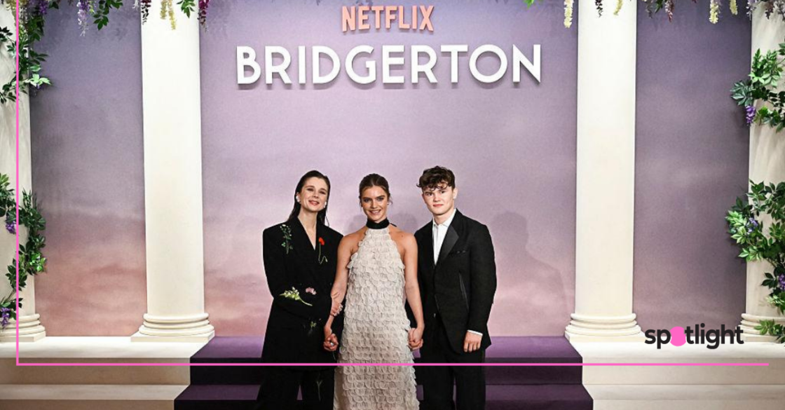
- Who uses it well: Netflix (for passion and entertainment), Red Bull (for pure energy), and obviously, Coca-Cola (for that fun, energetic buzz).
- A heads-up: It’s super powerful, but too much can feel aggressive or even alarming. You’ve got to use it carefully.
Blue: Trust, Serenity, Reliability
Ah, blue. The colour of the sky and the ocean, it just feels calm, stable, and incredibly trustworthy. That’s why you see it everywhere, from corporate offices and banks to tech giants and social media platforms. It’s the go-to for anyone who wants to say, “We’ve got you covered.”
- Who uses it well: Facebook (it feels reliable and secure), IBM (trust in innovation), and Visa (financial stability and security).
- A heads-up: Go a bit too far, and your brand might come across as cold or even a bit distant.
Yellow: Optimism, Joy, Warmth
Yellow is basically sunshine in a bottle. It’s all about happiness, optimism, and warmth. Brands use it when they want to be seen as friendly, cheerful, and creative. It’s a great way to grab attention in a happy, energetic way.
- Who uses it well: McDonald’s (happiness, good times), Nikon (creativity, optimism), and Best Buy (good value, energy).
- A heads-up: Like a bright light, it can be a bit overwhelming if there’s too much of it, and it might seem a little childish in the wrong context.
Green: Nature, Growth, Health, Wealth
Green is the colour of life. It’s deeply tied to nature, symbolising growth, harmony, and freshness. Naturally, it’s a popular choice for eco-friendly brands, health and wellness companies, and even financial institutions (because, you know, money).
- Who uses it well: Whole Foods (natural, healthy), Starbucks (it has a very natural, earthy feel), and Spotify (growth and harmony).
- A heads-up: Be careful with the shade; a sickly green can make people feel… well, sick.
Orange: Enthusiasm, Creativity, Friendliness
Take the energy of red and the happiness of yellow, and you get orange! It’s a super vibrant and friendly colour, perfect for brands that want to seem accessible, fun, and creative.
- Who uses it well: Fanta (youthful fun), Nickelodeon (creativity and playfulness), and Amazon (accessibility, approachability).
- A heads-up: It can sometimes look a little cheap or unsophisticated if not used well.
Purple: Royalty, Luxury, Creativity, Mystery
For centuries, purple was the colour of royalty and luxury. Today, it still gives off that vibe of sophistication, creativity, and a touch of mystery. It’s a great way to stand out and suggest something a bit more unique.
- Who uses it well: Hallmark (creativity, sentiment), Cadbury (luxury, indulgence), and Yahoo! (imagination and distinctiveness).
- A heads-up: It can feel a bit too feminine or even artificial in some contexts.
Black: Sophistication, Power, Mystery
Black is the epitome of timeless elegance, power, and authority. It’s the go-to for any luxury brand, from high fashion to premium tech. It just screams sleek, modern, and serious.
- Who uses it well: Chanel (luxury, sophistication), Nike (power, performance), and Apple (sleek, premium design).
- A heads-up: Use too much, and it might feel a bit intimidating or even gloomy.
White: Purity, Simplicity, Cleanliness
White is clean, simple, and pure. It’s often used as a background colour to make other things pop, creating a sense of clarity, minimalism, and efficiency. It says “no clutter, no fuss.”
- Who uses it well: Apple (simplicity, elegant design), Adidas (clean performance), and Cottonelle (purity, softness).
- A heads-up: It can come across as a bit sterile or bland if you don’t have other elements to give it character.
Brown: Earthiness, Reliability, Wholesomeness
Brown is a grounded, earthy colour that just feels warm, honest, and reliable. That’s why you see it everywhere in the food industry, especially for coffee and chocolate, and for brands that promote organic or natural products.
- Who uses it well: UPS (reliability, grounded), Hershey’s (comfort, natural), and Nespresso (richness, natural).
- A heads-up: Without the right design, it can sometimes feel a bit dull.
It’s Not Just One Colour: The Power of Combinations and Context
But hey, it’s not all about a single colour, is it? Most brands use a whole palette. The magic really happens when you combine colours, figure out their proportions, and consider the context in which they’re used.
- Complementary colours (like blue and orange) create a vibrant contrast and a lot of energy.
- Analogous colours (like blue, blue-green, and green) feel harmonious and cohesive.
- Monochromatic palettes (different shades of the same colour) scream sophistication and minimalism.
And don’t forget cultural context! White can mean purity in one culture but mourning in another. Red can mean luck in China but danger in the West. You’ve got to think about your audience and where they live.
Our Approach: Crafting Colour with Purpose
So, how do we do it? At Spotlight Creative Agency, our process for choosing brand colours is way more than just picking what looks pretty. We dig into:
- Your Brand’s Vibe: Is your brand a “Sage” (all about wisdom), a “Hero” (about courage), or maybe an “Innocent” (all about optimism)? We match colours to your brand’s personality.
- Your Audience: Who are you trying to reach? We consider their age, background, and what they’re looking for.
- Your Industry: What are your competitors doing? Sometimes breaking away from the standard is the best way to get noticed.
- Your Core Message: What’s the one thing you want people to feel when they see your logo? Trust? Fun? Luxury? We make sure the colours communicate that instantly.
Your logo’s colour isn’t just paint on a canvas; it’s the emotional heartbeat of your brand. It’s the first impression, a silent cue that tells people who you are, what you stand for, and what kind of experience they can expect.
By meticulously choosing hues that resonate with your brand’s purpose and your audience’s psychology, you’re not just creating a memorable logo—you’re building a powerful, enduring connection. It’s not just smart design; it’s smart business.